Unity Jun


The Challenge
Local entrepreneurs Unity Jun approached us for a branding package to appeal to a growing audience in nutritional wellness. They wanted for the brand to feel approachable and friendly, and for the packaging labels to convey the effervescent quality of their delicious fermented drink.
Our Approach
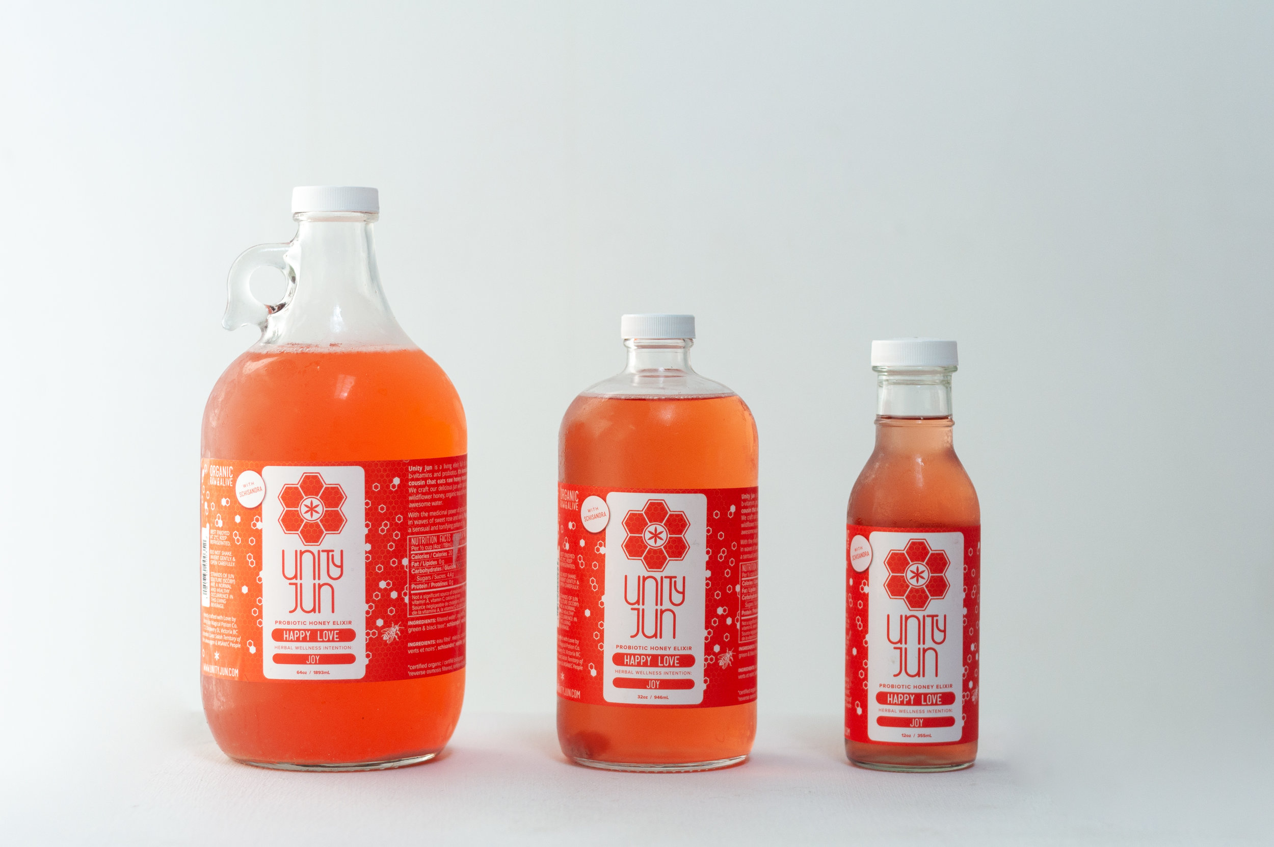
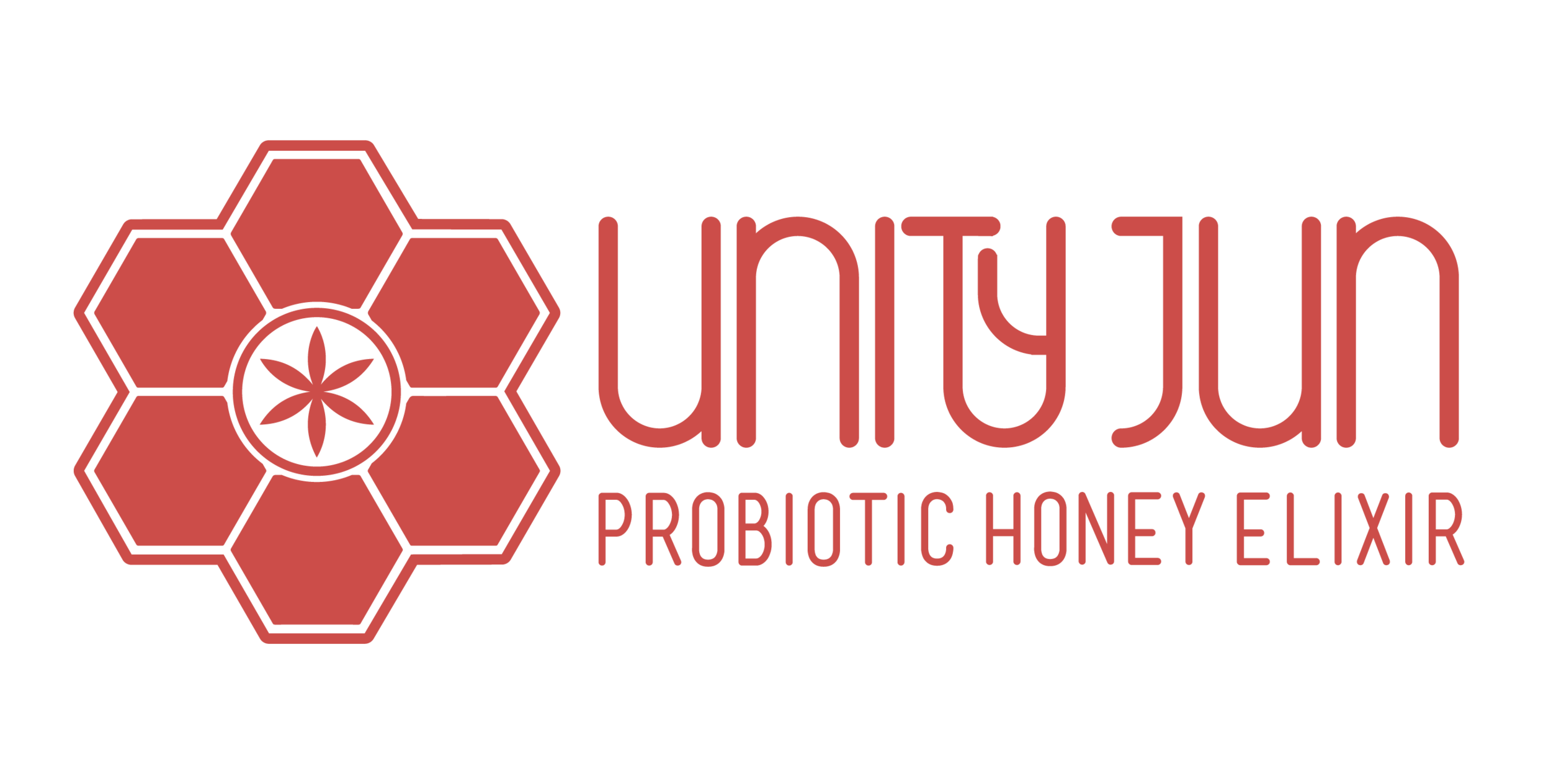
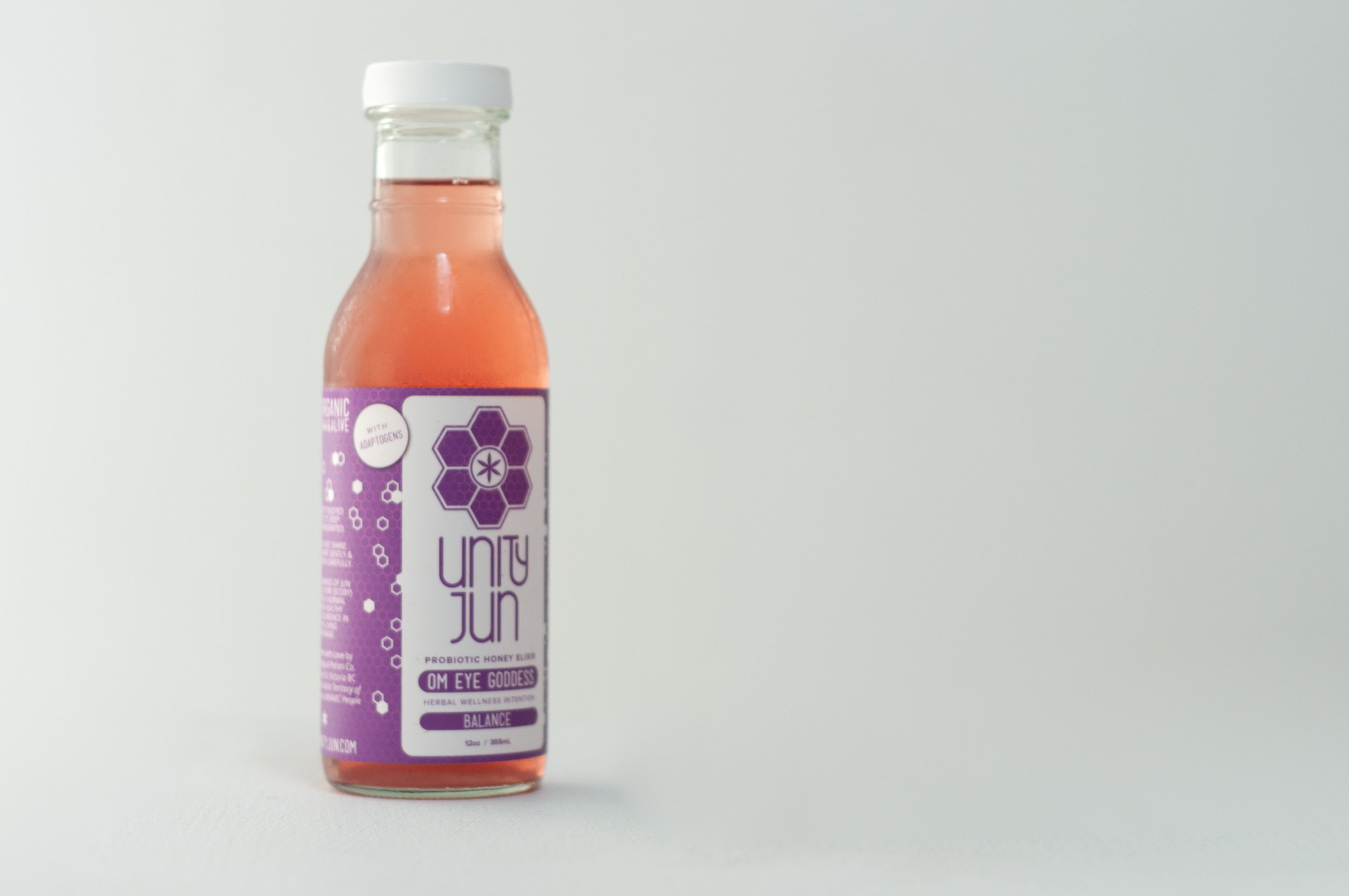
Jun is kombucha’s wild cousin, made using honey instead of sugar. Drawing inspiration from the honeycomb, we worked with a hexagonal grid in creating the logo mark, which also featured the ‘seed of life’ at its’ centre. Drafting a unique typeface for the company name was an unexpected surprise that really pushed the logo to the next level.
The Result
Our approachable & colourful branding package for Unity Jun helped this tiny start-up launch into the prolific wholesaler they are today; this delicious probiotic elixir can now be found in grocery stores across Vancouver Island.